Your home's exterior is the first thing people see, creating a lasting impression. A thoughtfully chosen paint scheme can highlight your house's best features and add value, all while expressing your personality. Let's delve into color palettes that perfectly complement popular architectural styles.
Classic Colonial: Timeless Elegance
- Traditional Charm: Colonials often feature symmetry and stately details. Crisp whites, soft grays, and classic navy blues are timeless choices. Consider a bold accent color for your front door – deep red or a vibrant yellow work beautifully.
- Modern Update: For a contemporary twist, explore darker grays, charcoal, or even black. This looks striking when paired with natural wood or stone accents and white trim for contrast.
Cozy Craftsman: Warm and Welcoming
Embracing Nature: Craftsman homes are known for their beautiful woodwork and earthy feel. Rich browns, forest greens, and creamy beiges are perfect for the main body of the house. Add pops of color on trim, porch railings, or window frames with burnt orange, terracotta, or a deep teal.
Mediterranean Magic: Sun-Kissed Vibes
- Coastal Inspiration: Stucco walls beg for warm whites, sunny yellows, and soft peach tones. Accentuate architectural details with terracotta reds or vibrant turquoise blues. Imagine the colors found around the Mediterranean Sea!
- Rustic Charm: If your home leans towards a Tuscan villa style, muted earthy tones like sage green, olive, and sandstone create a beautiful old-world feel.
Ranch Style Versatility: Modern and Cozy
- Mid-century Vibe: If your ranch has a retro-inspired feel, embrace it! Play with pastel pinks, blues, or minty greens, combined with crisp white for trim. A bright yellow door adds a cheerful touch.
- Contemporary Refresh: For a sleek, modern ranch look, consider shades of gray or greige. Incorporate natural wood accents and a pop of black on the trim or front door for a striking contrast.
Victorian Charm: Embellished and Bold
- Statement Colors: Victorians weren't afraid of color! Rich jewel tones like emerald green, sapphire blue, or deep amethyst look stunning on the main body. A palette of 3 – 4 complementary colors can be used to pick out ornate trim and gingerbread details.
- Historical Accuracy: If you want to stay true to the period, research historic Victorian color palettes. These often featured softer, more muted tones than the jewel-like colors we imagine.
General Tips
- Take Cues from Nature: Your surroundings are a great source of inspiration. Consider the colors of trees, foliage, and even your landscaping while picking a palette.
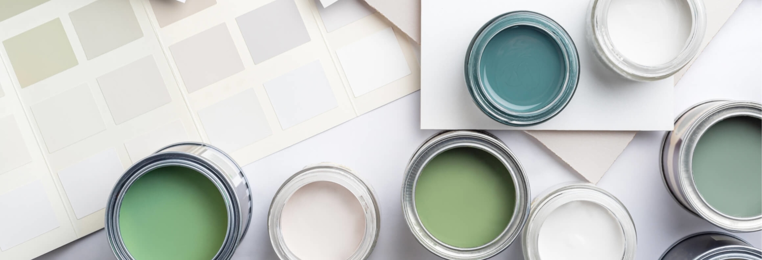
- Test Before You Commit: Always test paint samples on your house – colors look different throughout the day and in your specific environment.
- The Power of Accent Colors: Don't forget shutters, doors, and architectural details! These provide a great chance to add a touch of personality or create a welcoming focal point.
Embrace Your Style
Ultimately, the best exterior paint colors reflect your taste and make your home feel special. With a little research and some playful experimentation, you'll find the perfect palette to boost your curb appeal and make your house the envy of the neighborhood!


