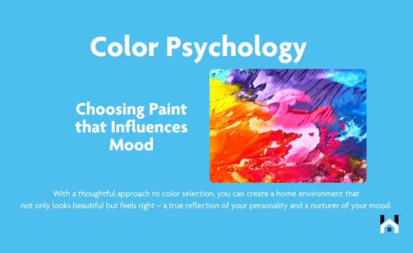
Color Psychology: Choosing Paint that Influences Mood
When it comes to interior design, the power of color is undeniable. Color psychology, the study of hues as a determinant of human behavior, plays a pivotal role in creating a desired mood in any space. As a homeowner or decorator, understanding the psychological effects of colors can help you choose the perfect paint to not only reflect your personal style but also to evoke specific emotions and behaviors in your home. In this blog, we’ll delve into the fascinating world of color psychology and guide you through choosing paint that influences mood.
The Impact of Color on Mood
Color can have a profound impact on our emotions. Warm colors, like reds, yellows, and oranges, can evoke feelings of warmth and comfort - but also anger and hostility. Cool colors, such as blues, greens, and purples, often create a sense of calm but can also summon feelings of sadness or indifference. Here's how to harness the power of color psychology in your home.
Warm Colors: Energy and Comfort
Red: Known as the most intense color, red is associated with energy, passion, and action. However, it can also raise a room's energy level, which might not be ideal for a bedroom but could be perfect for a dining area where you want to stimulate conversation and appetite.
Yellow: This color is often associated with happiness and motivation. Soft, pale yellows can work wonders in a kitchen or a bathroom, offering a sunny disposition in the morning. However, it's best to avoid using bright yellow as the main color scheme, as it can be overwhelming and may even provoke feelings of frustration.
Orange: Orange combines the energy of red and the happiness of yellow. It is associated with joy and sunshine. In its muted shades, like peach or terracotta, it can be used to give a cozy and welcoming vibe to social areas like living rooms.
Cool Colors: Calm and Serenity
Blue: One of the most calming colors, blue is said to bring down blood pressure and slow heart rate. Lighter blues are excellent for bedrooms and bathrooms where you want to create a tranquil and restful environment. Avoid darker blues as the main color, as it can evoke feelings of melancholy.
Green: Being the most restful color for the eye, green is suited for almost any room in the house. In the kitchen, a sage or apple green can cool things down; in a living room, olive green adds sophistication and warmth; and in a bedroom, a soft mint green can be especially restful. Green has a calming effect when used as a main color for decorating and has a sufficient warmth to promote comfort and togetherness.
Purple: Often associated with luxury and creativity, purple can be quite versatile. A deep eggplant purple can add drama and depth to a dining room, while a lighter lavender is perfect for creating a restful space in a bedroom.
Neutral Colors: Balance and Harmony
White: White can create a sense of space or add highlights. Designer's love white because it is incredibly versatile and can be warmed up or cooled down with accent colors.
Black: While not a popular choice for wall colors, black can be a bold accent in a space, grounding the color scheme and adding sophistication. Use it sparingly, though, as too much black can make a room feel smaller.
Gray: Gray is the new neutral, offering a modern take on interior spaces. It's a great background color that can be warm or cool and pairs well with almost any color.
Brown: Ranging from beige to dark chocolate, brown can be a warm and inviting color. Lighter browns work well in living rooms and bedrooms, creating a cozy and comforting atmosphere without the intensity of red or orange.
Choosing Paint with Purpose
Let's break down by room:
- Entryway: Welcome with warm colors or a bold statement color to set the tone for the rest of the home.
- Living Room: Neutral tones accented with personal color preferences create a communal atmosphere that is inviting. Go for warm and neutral colors if you want a cozy gathering space, or cool blues and greens for a calming effect.
- Kitchen: Reds and oranges can stimulate appetite and feel sociable, but use them cautiously, while greens and blues can create a balanced space for both cooking and socializing.
- Bedroom: Cool colors encourage sleep and relaxation; soft neutrals can also create a serene environment. Look for colors that promote rest and relaxation, such as soft blues, greens, and lavenders.
- Bathroom: Blues and greens promote a spa-like, clean atmosphere; light pinks can be flattering to skin tones.
- Children’s Room: Bright colors stimulate play and creativity, but they should be balanced with neutrals to avoid overstimulation.
- Home Offices: To encourage concentration and energy, consider green or light yellow.
Test Before You Paint
Before making a final decision, test your paint colors. Purchase sample sizes and paint a large swatch on the wall. Observe how the color looks at different times of the day and under various lighting conditions.
Consult a Color Wheel
A color wheel can help you understand color relationships and harmonies. Complementary colors (opposite each other on the wheel) can make a vibrant contrast, while analogous colors (next to each other on the wheel) provide a more harmonious feel.
The Psychological Power of Accent Colors
Don't underestimate the power of accents. A pop of color in throw pillows, artwork, or a single accent wall can dramatically alter the mood of a room without overwhelming it.
Incorporating Personal Preference
While color psychology provides a useful guideline, personal preference should never be overlooked. The colors you love will have the best psychological effect because they make you feel at home.
Embracing Color Trends with Caution
While keeping up with color trends can be fun, they should be approached with caution. Today's on-trend color can quickly become tomorrow's dated design. However, if a trendy color speaks to you, introduce it through accessories or a single feature wall, which is easier to change than an entire room.
Color and Climate Interplay
The climate you live in can also influence your color choice. In colder climates, warm colors can make a room feel cozier, whereas, in warmer climates, cool colors can be quite refreshing.
Texture and Furniture: The Complementary Accomplices
Textures and furniture also contribute to the mood of a room. Soft textures and curved furniture in warm-colored rooms can enhance the coziness, while sleek textures and straight-lined furniture in cool-colored rooms emphasize tranquility and formality.
Color Psychology in Action: Case Studies and Real-Life Transformations
The Invigorating Kitchen:
Case Study: A homeowner decided to liven up their outdated kitchen. They chose a vibrant shade of yellow for the walls, complementing it with white cabinets and a sky-blue backsplash. Post-renovation, the family reported spending more time together in the kitchen, enjoying meal preparations and feeling generally more energized during the day. Yellow, often associated with cheerfulness and mental stimulation, proved to be the perfect hue for creating a lively space that encourages family interaction and culinary creativity.
The Tranquil Bedroom Retreat:
Real-Life Transformation: After struggling with sleep, a couple painted their bedroom a soft shade of blue, hoping to create a more restful environment. The calming effect of blue, known to lower heart rate and reduce blood pressure, turned their bedroom into a tranquil retreat. They found themselves looking forward to unwinding at the end of the day, and their sleep quality improved significantly.
The Productive Home Office:
Case Study: Transitioning to a home office prompted one individual to transform a spare room. They chose a mid-tone green, balancing the serenity of blue and the optimism of yellow. This choice aimed to reduce work-related stress and promote concentration. Feedback indicated that the green environment reduced anxiety levels and the individual experienced improved focus and productivity.
The Rejuvenating Bathroom Oasis:
Real-Life Transformation: A homeowner wanted to turn their primary bathroom into a spa-like sanctuary. They opted for a palette of soft grays with lavender accents, inspired by the color's association with elegance and relaxation. The lavender touches added a subtle energy without disrupting the serene vibe. The result was a peaceful and luxurious space that invigorated the homeowners’ daily routines.
The Dining Room Designed for Engagement:
Case Study: A family who loved to host dinners chose a rich, warm terra cotta color for their dining room. This earthy hue is believed to stimulate conversation and appetite. Post painting, guests commented on the room's inviting and warm ambiance, and dinner parties lingered longer, filled with lively discussions.
The Energetic Workout Space:
Real-Life Transformation: To create a motivating workout space, vibrant orange was the color of choice for a fitness enthusiast's home gym. Orange is energetic and can increase oxygen supply to the brain, producing an invigorating effect. This choice helped the homeowner feel more motivated and energetic during exercise routines.
The Calming Nursery:
Case Study: Expectant parents chose a soft, pastel green for their nursery. The color green is associated with health and renewal, perfect for a new beginning. It's gentle enough not to stimulate the baby excessively, promoting a calm atmosphere for both the baby and the parents. After the baby arrived, they noticed the color helped maintain a peaceful vibe during feeding times and naps.
The Creative Studio Space:
Real-Life Transformation: An artist transformed their studio space with a palette of soft purples and neutral tones. Purple, often connected with creativity and spirituality, provided a sense of inspiration and focus. The artist reported feeling more imaginative and less constrained by creative blocks in this environment.
The Social Living Room:
Case Study: A living room that once felt unwelcoming was transformed with a warm beige, accented with vibrant reds and oranges in the artwork and textiles. The beige created a warm, neutral canvas that fostered a sense of stability and balance, while the accents added a dynamic quality that invigorated social gatherings and family time.
The Harmonious Yoga Corner:
Real-Life Transformation: A corner of a home was dedicated to yoga and meditation. The homeowner painted the area a serene shade of aquamarine, aiming to evoke the calmness of the ocean and sky. Practitioners found the space to be conducive to mindfulness and reported feeling more at peace during their yoga sessions.
The Impact of Accents:
In all these examples, it's notable that the strategic use of accent colors can significantly enhance the psychological effects of the primary color scheme. For instance, the yoga corner benefited from sandy accents that grounded the space, while the vibrant kitchen was balanced by neutral elements to prevent overstimulation.
Cultural Color Considerations
Remember that color psychology can be culturally specific. What's calming in one culture may be considered sad in another. When choosing colors for your home, consider your cultural background and the emotional associations colors have for you personally.
The Mood-Enhancing Palette
Choosing paint colors is a journey of balance and in the end, the colors you choose to surround yourself with should resonate with you on a personal level. Use the principles of color psychology as a guide, not a rulebook, and don't be afraid to experiment. After all, your home is your canvas, and you are the artist. With a thoughtful approach to color selection, you can create a home environment that not only looks beautiful but feels right – a true reflection of your personality and a nurturer of your mood.
Need help with
your project?
Whether you’re planning a project or just trying to remember when to clean your gutters, we’ve got your back (and your inbox).